Choosing paint colors is easier when you stop starting with random swatches and start with the room. The best paint color depends on light, flooring, furniture, countertops, trim, and the mood you want.
Use AI Smart Decor to test paint color directions in your actual room photo, then confirm finalists with real samples.
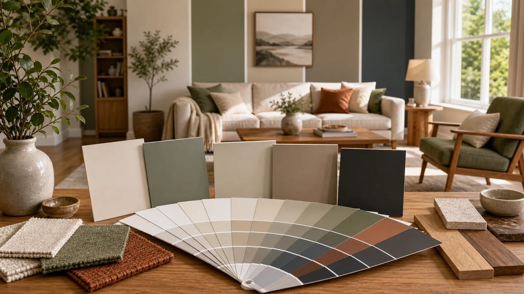
Want to try it now? Use the free paint color visualizer to preview color directions in your own room photo before buying samples.
Quick Answer: Paint Color Selection Process
| Step | What to Check | Why It Matters |
|---|---|---|
| 1 | Fixed finishes | Paint must coordinate with what stays |
| 2 | Natural light | Color changes throughout the day |
| 3 | Undertones | Prevents clashing beige/gray/white choices |
| 4 | Room mood | Calm, bright, cozy, dramatic, fresh |
| 5 | Whole-home palette | Keeps rooms connected |
| 6 | AI preview | Narrows options quickly |
| 7 | Physical samples | Confirms color in real conditions |
Start with Fixed Finishes
Fixed finishes are the things you are not changing:
- Flooring
- Countertops
- Tile
- Cabinets
- Stone fireplace
- Large furniture
- Wood trim
- Carpet
- Exterior view if it affects light
Paint should support these finishes, not fight them. For example, a cool gray wall can look wrong next to warm beige tile, while a warm greige may feel more natural.
Understand Undertones
Undertone is the subtle color hiding inside a paint.
Common undertones:
- Warm white: yellow, cream, beige
- Cool white: blue or gray
- Greige: beige + gray
- Taupe: gray-brown with possible violet
- Green-gray: muted green undertone
- Blue-gray: cool blue undertone
- Pink beige: beige with rosy warmth
The fastest way to spot undertone is to compare paint chips next to true white and next to your flooring or counters.
Choose the Room Mood
Different rooms need different emotional effects.
| Room | Good Paint Direction |
|---|---|
| Living room | Warm white, greige, soft taupe, muted green |
| Bedroom | Soft blue, sage, warm neutral, muted gray |
| Kitchen | Warm white, cream, pale gray, soft green |
| Bathroom | Clean white, spa blue, soft green, warm gray |
| Home office | Greige, muted blue, olive, warm white |
| Dining room | Deeper taupe, navy, clay, warm neutral |
| Nursery | Soft cream, muted sage, pale blue, blush beige |
The right color is the one that supports how the room should feel.
Use the 60-30-10 Rule
A balanced room often uses:
- 60% dominant color: walls or large surfaces
- 30% secondary color: sofa, curtains, rug, cabinets
- 10% accent color: pillows, art, decor, lamps
Paint does not have to be the boldest color. In many strong rooms, wall color is the quiet backdrop.
Best Paint Colors by Goal
Make a Room Feel Bigger
Use warm white, soft cream, pale greige, or light green-gray. Keep trim close in color to reduce visual breaks.
Make a Room Feel Cozy
Use taupe, clay, olive, warm gray, mushroom, charcoal, or muted navy. Add warm lighting and texture.
Make a Room Feel Brighter
Use light reflective colors, but avoid stark white in low-light rooms. A warm off-white often looks better than pure white.
Make a Room Feel Modern
Use warm white, greige, charcoal accents, black trim details, or muted earth tones. See modern interior design.
How Lighting Changes Paint
Paint changes under different light:
- North-facing rooms: cooler, grayer light
- South-facing rooms: warmer, brighter light
- East-facing rooms: bright morning, cooler afternoon
- West-facing rooms: warm afternoon/evening light
- LED bulbs: color depends on temperature
Test samples on multiple walls and check morning, afternoon, and evening.
Step-by-Step Paint Color Process
Step 1: Photograph the Room
Take a straight photo of the room in daylight and another in evening light. This gives you a record of how the room actually looks before you start testing colors. If you use AI, upload the daylight photo first because it usually shows undertones more clearly.
Step 2: Pick Three Color Families
Do not start with twenty paint chips. Pick three families first: for example warm white, greige, and muted green. AI can help you compare those directions quickly. Once the family is chosen, then test specific paint brands and shades.
Step 3: Compare Against Fixed Finishes
Hold samples next to the floor, trim, counters, tile, sofa, and cabinets. A paint color that looks good alone can look wrong next to orange wood, pink beige tile, or cool gray flooring.
Step 4: Sample Before Painting
Use large sample boards or paint patches on at least two walls. Check them at different times of day. The winning color should look good in the room's worst light, not just in the best light.
Paint Finish Guide
| Finish | Best For | Watch Out |
|---|---|---|
| Flat | Ceilings, low-traffic adult spaces | Harder to clean |
| Matte | Bedrooms, living rooms | Shows marks more than eggshell |
| Eggshell | Most walls | Good balance for normal homes |
| Satin | Bathrooms, kitchens, trim in some homes | Can show wall flaws |
| Semi-gloss | Trim, doors, cabinets | Too shiny for most walls |
For most rooms, eggshell is the safest wall finish. Bathrooms, kitchens, and kids' spaces may need satin depending on ventilation and cleaning needs.
Paint Color Examples by Fixed Finish
| Fixed Finish | Paint Direction to Try |
|---|---|
| Orange oak floors | Warm white, cream, muted green, soft taupe |
| Cool gray floors | Soft white, greige, blue-gray, charcoal accents |
| Beige tile | Warm white, mushroom, tan, muted olive |
| White quartz counters | Warm white, pale gray, sage, navy accents |
| Dark wood furniture | Cream, greige, clay, muted blue |
Use these as starting points, not final answers. The same paint can look different depending on window direction, bulb warmth, and nearby furniture.
Trim, Ceiling, and Door Color
Trim and ceiling color can change how the wall color reads. For a quiet look, use the same white on trim and ceiling, then choose a wall color that relates to it. For a softer room, use a slightly warm trim instead of a stark white. For a dramatic room, walls, trim, and doors can be painted the same color, but test it first because this look changes the room mood strongly.
Doors do not always need to be white. In hallways, bedrooms, and dining rooms, a muted door color can connect the palette from one space to another.
Final Paint Checklist
Before buying gallons, confirm:
- The color works with flooring and counters.
- The sample looks good in morning and evening light.
- Trim and ceiling colors have been chosen.
- The finish matches the room use.
- Adjacent rooms do not clash.
- You have tested a large enough sample.
This small checklist prevents most repainting regret.
Room-by-Room Paint Examples
Living Room
For a living room, start with the sofa, rug, flooring, and curtain color. Warm white, greige, soft taupe, and muted green are safe starting points because they work with many furniture styles. If the room has dark furniture, keep the wall color softer so the space does not feel heavy.
Bedroom
Bedrooms usually work best with quieter colors. Try warm white, muted blue, sage, clay, beige, or soft gray. Avoid choosing a color only because it looks dramatic in a photo. The bedroom should still feel restful when you wake up and when lamps are on at night.
Kitchen
Kitchens need to coordinate with cabinets, counters, backsplash, appliances, and flooring. If those finishes are already busy, use a quiet wall color. If the finishes are plain, the wall color can add warmth or contrast.
Bathroom
Bathrooms often have less natural light, so sample carefully. Warm white, soft green, pale blue, and gentle taupe can work well. In a small bathroom, keep trim and wall color close if you want fewer visual breaks.
How to Use AI Without Skipping Samples
AI is useful for choosing a direction, not the exact paint chip. Use it to compare color families in your room photo: warm white vs greige, sage vs blue-gray, or dark accent wall vs full-room neutral. Once you know the direction, buy physical samples and test them on the real wall. This gives you speed at the beginning and accuracy at the end.
How AI Helps Choose Paint Colors
AI can quickly show whether a color family works in your room.
Use AI to test:
- White vs warm neutral
- Sage vs blue-gray
- Dark accent wall vs full-room color
- Cabinet color changes
- Trim contrast
- Whole-room palette
- Furniture and paint together
AI is best for narrowing options. Real samples are still best for final selection.
Paint Color AI Prompt
Preview this room with a realistic interior paint color update. Preserve the room structure, furniture scale, flooring, windows, and natural lighting. Show warm neutral wall colors that coordinate with the existing floor and furniture, plus one version with muted sage and one with soft greige. Keep the result photorealistic and suitable for a real home. Avoid changing the architecture or replacing major furniture unless requested.
Common Paint Color Mistakes
- Choosing paint before checking flooring and counters
- Using pure white in a low-light room
- Ignoring undertones
- Testing only one wall
- Choosing from a phone screen only
- Painting every room a disconnected color
- Using trendy colors on expensive-to-change surfaces
- Forgetting trim and ceiling color
Whole-Home Paint Palette Tip
If you are choosing colors for more than one room, build a simple whole-home palette instead of treating every room separately. Pick one main neutral for hallways and shared spaces, one trim color, two or three room colors, and one or two accent colors. Repeating colors in different strengths makes the home feel connected while still allowing each room to have personality.
This is especially helpful for open-plan homes where the living room, dining room, and kitchen are visible at the same time. Test the palette with AI first, then sample the final paints on real walls.
Final Recommendation
Choose paint color by starting with what already exists in the room. Identify undertones, decide the mood, preview options with AI, then test real samples before painting. This process saves time, money, and repainting regret.