Most people's mental image of "AI-generated art" comes from abstract generators producing surreal, stylized images. AI-generated room design is a different category entirely — the goal is photorealistic visualization of real spaces, and when it works correctly, the output is convincingly real.
This post focuses on what AI-generated room designs actually look like: the common styles, what makes quality high or low, and how to control the output toward the results you want.
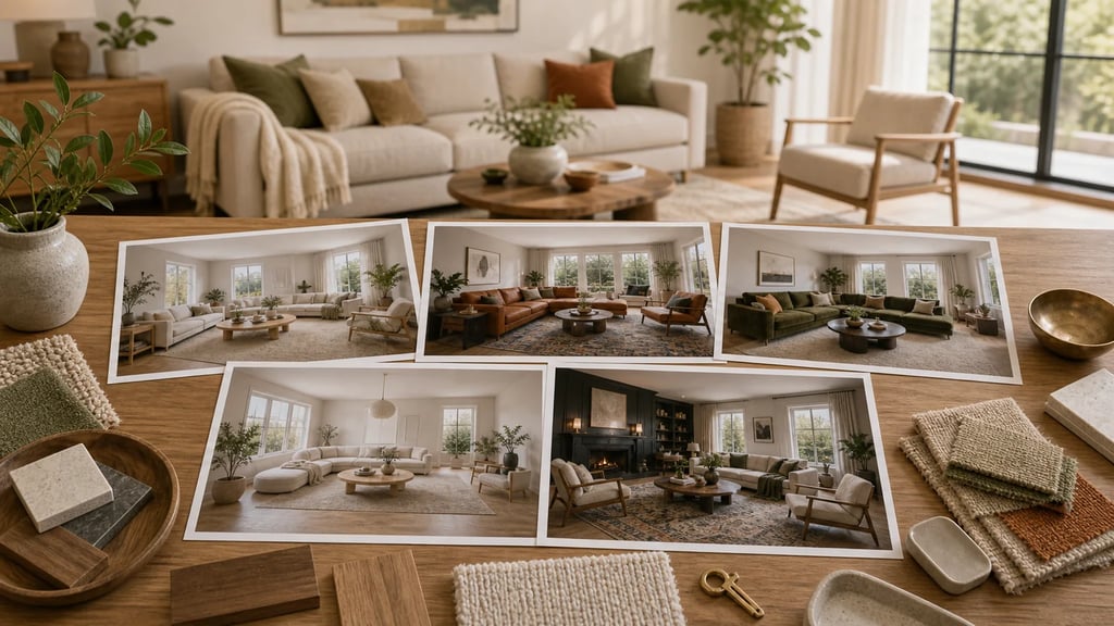
Want to try it now? Use the free AI room design generator to upload a room photo and preview AI-generated room concepts before reading the examples.
What Good AI-Generated Room Design Looks Like
A high-quality AI-generated room design has these characteristics:
- Furniture sits naturally in perspective — legs touch the floor, pieces don't float
- Materials render with correct reflectance: matte paint reads flat, polished surfaces have specular shows, textiles show weave texture
- Lighting is directionally consistent — shadows fall the right way, windows produce natural-looking wash
- The room feels inhabited rather than staged — deliberate but not sterile
- Architectural features (windows, doors, molding) remain where they were in the original photo
When AI-generated designs fall short, the failure modes are recognizable: furniture that appears to hover above the floor, walls that don't meet at correct angles, textures that smear rather than render crisply, or lighting that contradicts the window positions in the original photo.
Understanding what drives each failure mode helps you avoid it.
The Most Commonly Generated Styles
AI tools tend to generate more reliably in certain aesthetic directions. Here's what to expect from the most popular styles:
Scandinavian / Japandi
Output characteristics: Light wood tones, off-white walls, low-profile furniture, minimal accessories, textile layering with natural fibers. Often produces the most photorealistic results because the style vocabulary is well-represented in training data and has low decorative complexity.
Quality level: Consistently high. Clean edges, uncluttered composition, and neutral palette are technically easier for the generative model to render convincingly.
Best for: Living rooms, bedrooms, dining areas.
Modern Minimal
Output characteristics: Monochromatic palette (whites, greys, blacks), statement furniture pieces with strong silhouettes, deliberate use of negative space. Very little accessory clutter.
Quality level: High. The simplicity of the visual vocabulary reduces the number of elements that can go wrong.
Best for: Any room type. Particularly effective for small spaces, which benefit from the AI's tendency to maximize perceived openness.
Contemporary
Output characteristics: Mixing of materials (wood, metal, stone, glass), bold accent colors against neutral bases, a balance between minimalism and warmth. More decorative than Modern Minimal but not as complex as Traditional styles.
Quality level: High to very high. The blend of materials is a challenge the model generally handles well, producing renders with interesting material contrast.
Best for: Living rooms, open-plan spaces.
Industrial
Output characteristics: Exposed brick or concrete textures, dark metal elements, raw wood, Edison bulbs, warehouse-scale proportions suggested through furniture scale. Can feel stark in small rooms.
Quality level: Medium to high. Exposed material textures (brick, concrete) are technically demanding — poorly generated Industrial renders show as plasticky or flat-looking surfaces. Higher-quality tools handle this well; budget tools often don't.
Best for: Living rooms, studios, open loft-type spaces. Works less convincingly in bedrooms.
Bohemian / Eclectic
Output characteristics: Layered textiles, mixed patterns, global influences, plant abundance, warm light, deliberately imperfect arrangement. The most visually complex style category.
Quality level: Medium. The decorative complexity means more elements to generate, and the AI sometimes struggles to maintain visual coherence across all of them simultaneously. Accessories may look over-generated or inconsistent.
Best for: Bedrooms and reading nooks. Avoid for rooms where clean, professional presentation is the priority.
Traditional / Classic
Output characteristics: Formal symmetry, dark wood furniture, upholstered pieces with rolled arms, drapery, crown molding emphasis, warm palette. Heavy decorative language.
Quality level: Medium. Traditional furniture silhouettes are distinctive enough that misrenders are obvious — carved legs, tufted backs, and ornate details are technically demanding. The best tools handle it well; mid-tier tools often produce furniture that looks generically approximate rather than specifically traditional.
Best for: Formal dining rooms, master bedrooms.
Quality Level Comparison Across Tools
Not all AI-generated room design tools produce the same quality. Here's what differentiates output levels:
| Quality Tier | Characteristics | Typical Use Case |
|---|---|---|
| High (AI Smart Decor, Interior AI) | Photo-level realism, correct material physics, accurate perspective, coherent lighting | Listing photos, client presentations, purchase decisions |
| Mid | Generally correct but with artifacts — slight floating furniture, texture inconsistencies | Personal exploration, rough direction-setting |
| Low (many free mobile apps) | Stylistically recognizable but clearly artificial — wrong proportions, plastic-looking materials, obvious AI tells | Inspiration only; not suitable for sharing or professional use |
The difference in output quality is driven by model size (larger models produce better results), training data quality (more professionally photographed interiors = better style understanding), and inference parameters (more denoising steps = more refined output, but slower).
What Affects Output Quality: The Variables You Control
You can't control which model runs under the hood, but you control the inputs — and input quality has a significant effect on output quality.
Photo Quality
| Input Condition | Effect on Output |
|---|---|
| Bright natural daylight | Best possible output — depth and texture models perform optimally |
| Overcast natural light | Very good — diffuse, even illumination |
| Indoor artificial light only | Moderate — warm color cast can confuse color reproduction |
| Dark room | Poor — depth estimation degrades significantly in low light |
| Heavy JPEG compression | Poor — block artifacts misinterpreted as texture |
Composition
| Input Condition | Effect on Output |
|---|---|
| Shot from corner, full room visible | Best — AI has full room context |
| Shot from doorway, partial room | Good — portions out of frame won't be redesigned |
| Close-up of one section | Limited — AI generates partial redesign only |
| Wide-angle distortion (fish-eye) | Poor — geometric distortion breaks depth estimation |
| Clutter and mess | Moderate — AI struggles to segment cluttered areas cleanly |
Style Selection
| Style Selection | Realism Impact |
|---|---|
| Realistic photographic style | Highest photorealism |
| Painterly or sketch style | Intentionally non-photorealistic |
| Specific named style (Scandinavian, etc.) | High, especially for well-represented styles |
| Vague or mixed style prompts | Lower confidence, more randomness in output |
Photorealistic vs. Artistic Results: How to Control the Output
Not every use case requires photorealism. Here's how to get either intentionally:
For photorealistic output:
- Photograph in daylight, decluttered room
- Select a realistic interior style — not "watercolor" or "sketch" presets
- Use full-room market photos
- Generate 3–4 variations and select the most coherent
- Use a tool with high-resolution output (avoid tools that cap at 512px)
For artistic/conceptual output:
- Slightly stylized input photos work fine (don't overthink it)
- Select artistic style presets if available
- Use as inspiration boards rather than direct implementation references
- Lower-resolution output acceptable — you're not implementing directly
What matters: photorealistic output requires photorealistic input. The generative model can do a lot, but it can't synthesize detail from a dark, low-resolution, distorted photo.
Generating Results for Different Room Types
Different rooms have different success rates with AI generation. Here's what to expect:
Living rooms: Highest success rate. Large surfaces, prominent furniture pieces, and diverse style options make this the AI's most confident territory.
Bedrooms: Very high success rate. The primary challenge is bed sizing — AI sometimes misjudges proportions if the bed isn't clearly visible from edge to edge.
Kitchens: Moderate success. Cabinetry and appliances are architecturally fixed; the AI can change colors and surface materials but cannot reconfigure the layout. Lower "wow factor" than open rooms.
Bathrooms: Lower success rate. Tight spaces and complex fixture geometry are difficult for AI to render convincingly. Most tools struggle with accurate bathroom redesigns.
Dining rooms: High success rate. Clear furniture roles (table, chairs) and open space work well for the generation model.
Home offices: High success rate. Clean and functional aesthetics are well-represented in training data.
Tips for Getting the Best Results from AI Smart Decor
AI Smart Decor's generation pipeline is improved for real-room inputs. These specific practices improve output quality:
- Shoot from the far corner. Position yourself in the corner diagonally opposite the main focal point. This captures maximum room width and depth.
- Hold the camera at chest height. Eye-level shots are fine; avoid shooting from floor level or ceiling level — the perspective distortion reduces depth model accuracy.
- Use daylight, avoid lamps. Turn off all interior lights when natural light is sufficient. Mixed natural/artificial light sources confuse the color balance in outputs.
- Declutter aggressively. A clear floor and clear surfaces give the AI clean segmentation — it knows exactly what to replace. Clutter creates ambiguity.
- Try the same room in 3 styles. Scandinavian, Contemporary, and one wildcard. The contrast often reveals which direction your room's architecture naturally lends itself to.
- Regenerate until you get a coherent result. The generation has randomness built in. The third or fourth output of the same settings is often substantially better than the first.
Final Quality Check
Before you save a generated design as your reference, zoom in. Look for warped furniture legs, strange reflections, broken window frames, and materials that bleed from one surface to another. If the image has a strong idea but weak details, regenerate with the same style instead of forcing that version into a real plan.